
I had the exciting opportunity to start the "Healthcare Leadership and Advocacy Organization (HALO)" from the "ground up." Tasked with the developing the look and feel of the digital and print materials. I felt it was important to develop brand standards that spoke to the compassion behind the mission of the organization:
to promote, protect, and advocate for the rights of the medically vulnerable
to promote, protect, and advocate for the rights of the medically vulnerable
The color yellow was chosen as an accent and primary hue because it is imbued with the same logic and intellect that we wanted to impart with the educational materials that we created.
Also hues in the yellow color family (and the hope they impart) were especially appropriate because many of people who reach out to HALO for help in there time of need are also looking for encouragement and consolation.


Using Greek letter-forms I crafted the logo as a subtle nod to the Hippocratic Oath, where physicians swear to uphold certain ethical standards. HALO, like the physician that this oath is attributed to, believes in defending the medically vulnerable "from the beginning to the end" or if you prefer from "alpha to omega."
If you look closely you'll notice that those two characters are visually connected.
If you look closely you'll notice that those two characters are visually connected.
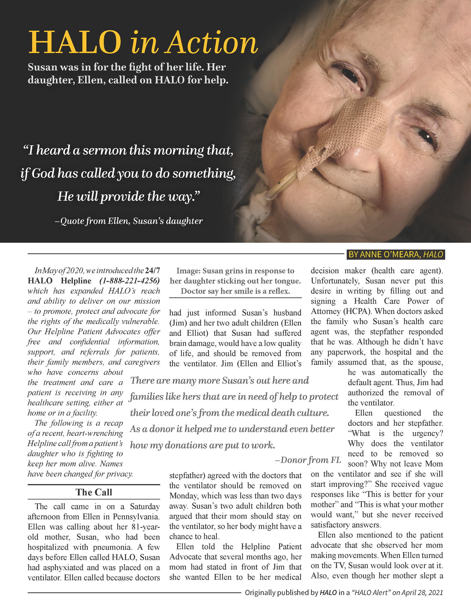
The challenge with this brand is that the demographic targeted is facing the grave consequences of healthcare rationing and unethical practices. It was a fine line to walk when attempting to communicate both the danger that lies ahead but also the hope that exists in healthcare done right. View the examples below to decide if you think the visual message was handled with care.